C Mini — Project 3
Typesetting
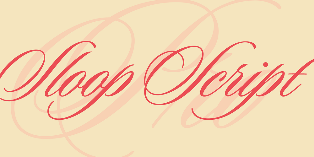
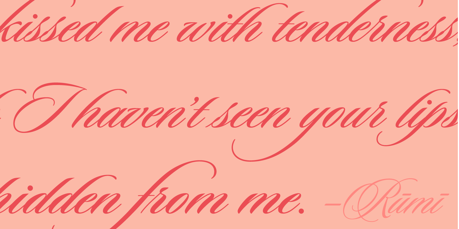
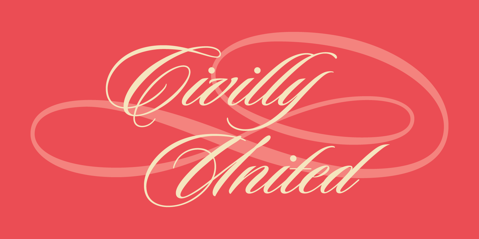
Name: Sloop Script
Designer: Robert Lipton
Country of Origin: United States
Released: 1994
Family: Script-Cursive
Adjectives: elegant, classic, dramatic, humanistic, dynamic, graceful
Crafting a narrative

Creating the Spread
Before starting to create the spread I needed to find a typeface to pair with Sloop Script. I looked for examples of Sloop in use to see what it has been paired with by other designers. I used the website fontsinuse.com as a starting place.
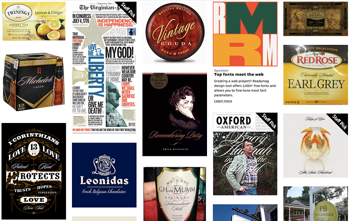
I narrowed down my options to Futura, Minion, Trade Gothic and Gill Sans. I decided that a sans serif would look best and eliminated Minion. Of the three remaining typefaces I chose Trade Gothic.
As I started to test text layouts, I started by looking at magazines I had around. The magazines I had weren’t helpful. I then sketched out possible layouts on paper over the grid.
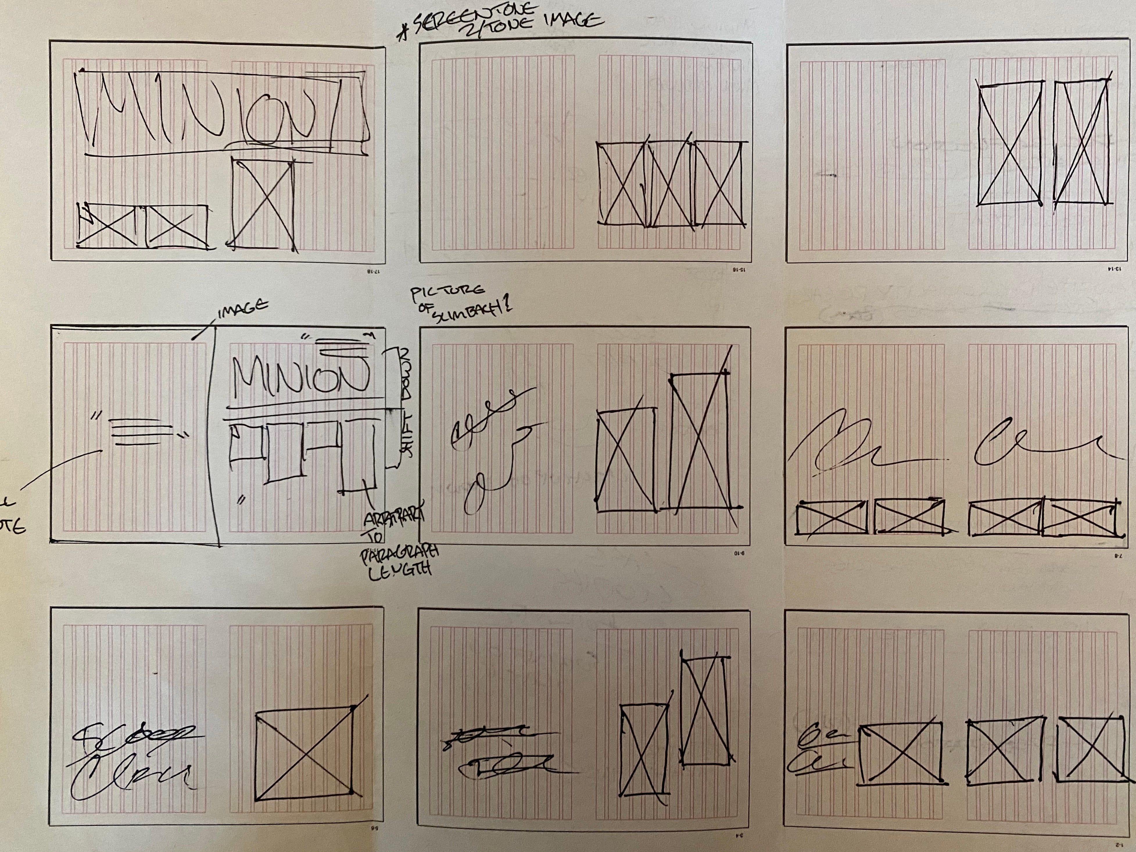
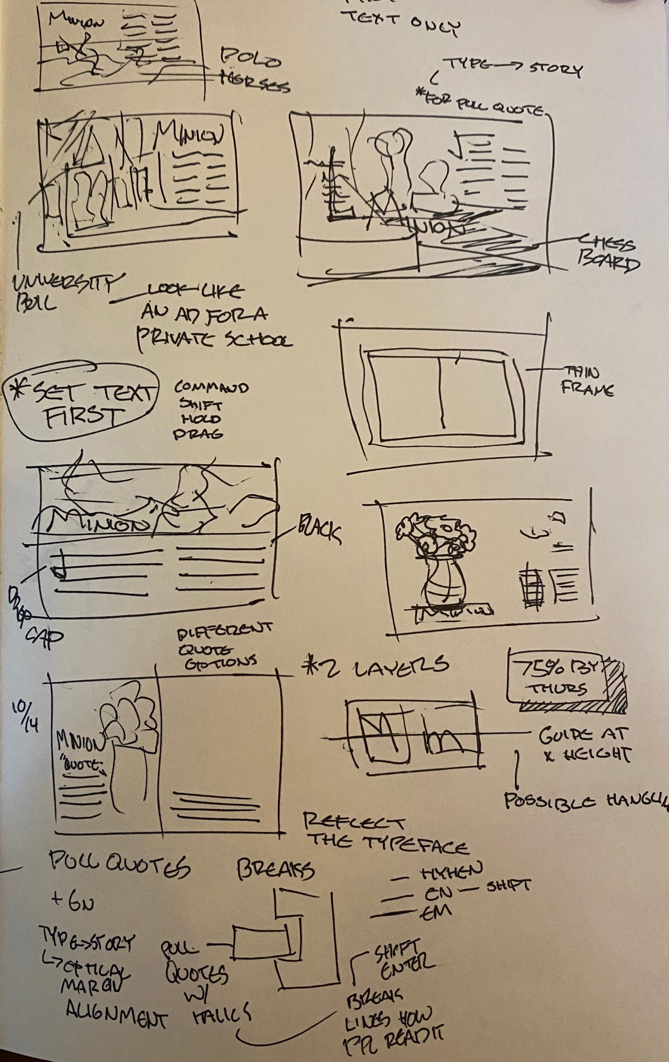
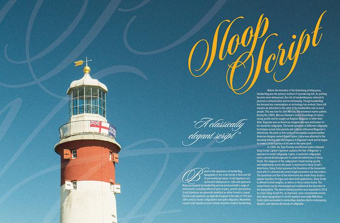
At this point I also started to think of possible image choices. I tried to think of things that would share the same descriptive adjectives as Sloop Script. I then got on InDesign and tested these images with the text layouts that I had drawn

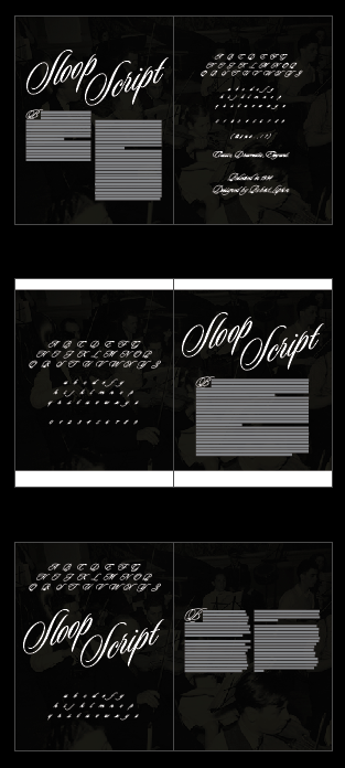
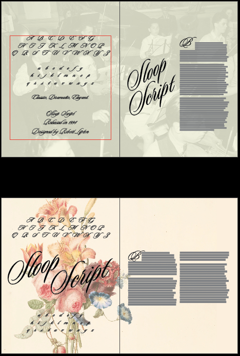
In InDesign, I tested more text layouts. I ended up rewriting parts of my essay so that words and letters would fall on the page better. I changed small bits and pieces here and there to effect the rag. I tested using justified body text in a few iterations. It ended up being much more effective in layouts where I used a single larger column. However, with just one larger column, I had a difficult time finding ways to fill the space of the spread. Also, the larger blocks of text looked a lot more daunting to read and felt like more text.
I tried using a drop cap for the first paragraph to create an entry point for the reader. My original essay started with the letter “S”. With Sloop Script already starting with S’s using an S drop cap didn’t feel right. There were way too many S’s on the page. To fix this I rewrote the first part of my essay. I looked through Sloop Script’s alphabet and tried to find which letter I felt looked the most appealing to me. I settled on B, K, M, N, R and W. I tried to find different ways to rewrite the first sentence or two so that I could start the essay with one of these letters so that my drop cap would work effectively. I was able to start my essay with the letter B in a way that made sense.
After critique, it was clear that the images I had picked weren’t as effective as I would have hoped. Vicki suggested leaning into the nautical theme that was hinted at in the essay. At this point, I selected a group of new images from Unsplash. I didn’t want the sailing association to be too heavy handed.
I also decided to rethink my color choices to better fit the nautical theme. Two movies came to mind: The Life Aquatic with Steve Zissou and Blow the Man Down. Both movies had nautical themes and memorable color palettes. I created a few palettes using Adobe Capture and movie posters and screenshots from these two movies. The use of yellow text over a blue background in both films was something that I wanted to utilize in my spread.
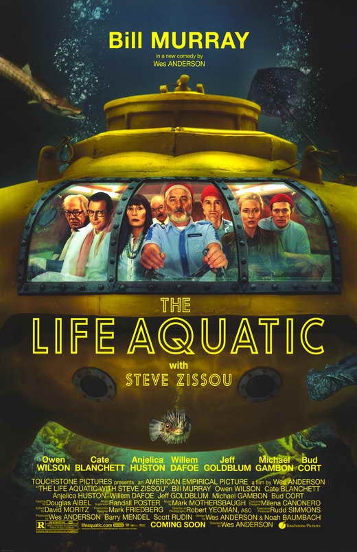
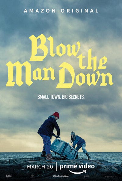
I used most of the same layouts from previous iterations and just applied changes to my image selection and color palette.


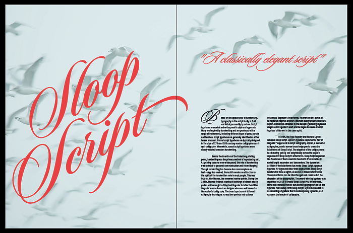
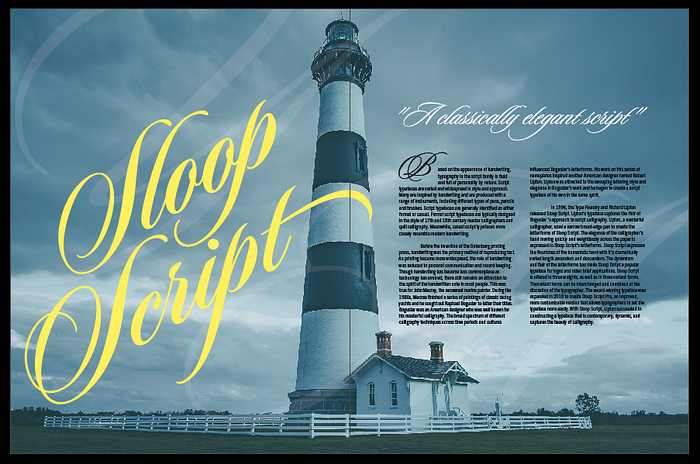

The image with the red and white lighthouse received the best response during critique, so I decided to use it as my final image. I got a bit of pushback on my use of the alphabet in critique as well. I had been using the alphabet as a way to show as much of the typeface as possible. I had a difficult time finding a way to display the typeface aside from title. With my body text not being Sloop Script, I was a bit worried that my spread wasn’t showing the typeface enough. I added pull quotes that I set in Sloop Script to help fix this issue. I tried to find ways to show the typeface more without being distracting or feeling like a waste of space.

This attempt wasn’t as effective as I hoped. The words on the left didn’t do what I wanted so I abandoned this solution. I went back to using the oversized low opacity letterforms to help give a sense of the type. I revisited the image of the lighthouse and extended the image so that I could change the proportions and placement of the lighthouse on the page to help the left side of the spread feel less empty.
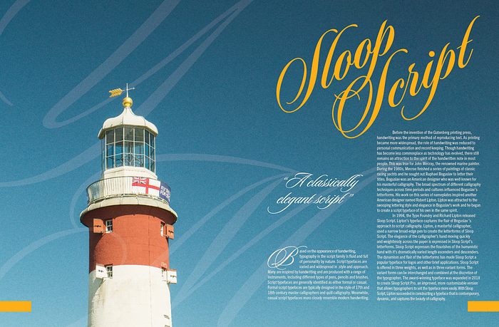
This solution still didn’t feel quite right. A few elements however, I feel like are very effective. At this point I think the placement of the lighthouse is just right as the arrow on top points to the title and the lighthouse fills the right amount of the page. The oversized low opacity letterforms help give an impression of the typeface without being too heavy handed. They also give off the impression of wind which fits the feeling of the typeface. However, these letterforms didn’t seem to be using the space effectively as possible. There are gaps that feel empty. I tried changing the proportions of these letterforms as well as my choices in letters to better fit the space.
